
How to Read an Attention Heatmap and Know When to Trust It
An attention heatmap for an ad is a prediction of where viewers' eyes land, not a measurement. Trust it only when a key element beats a map that simply favors the center.

By Sachit Sharma, CEO & Founder · Updated 4 Oct 2026

Key takeaways
- 01A predicted attention heatmap is worth acting on only when a must-see element, such as the offer or the call to action, gets at least 1.5 times the heat that a map built only from the image center would give it. The 1.5 threshold is our judgment, not a published standard.
- 02Of four vendor pages read in October 2026, three name no metric and the fourth names correlation without naming a dataset. A center-only map already scores well on the public benchmark, so a hot spot near the middle proves little.
- 03A box for each must-see element, one grayscale heat layer and a short script tell you whether a hot spot comes from your design or from where you placed it.
- 04A heatmap predicts visibility, not clicks or sales. A before-and-after change in predicted attention is not an A/B test. Use heatmaps to cut weak variants, then test the rest.
In this article
- 1What does an attention heatmap show on an ad?
- 2Can you trust the accuracy figures that predicted-attention tools publish?
- 3Why does center bias make a heatmap look right when it is not?
- 4How do you check an attention heatmap against center bias?
- 5What should you change when an element fails the center-bias check on an attention heatmap?
- 6Is a before-and-after attention heatmap the same as an A/B test?
- 7Is an attention heatmap in machine learning the same thing?
- 8Frequently asked questions
A heatmap that glows red over your product looks like proof that people will see it. The colors cannot tell you whether to believe them. They come from a model trained on where people looked in other pictures, and those models start from a strong habit: eyes drift toward the middle of an image.
How well do such models work on ads and screens? A 2026 study compared vision-language models (AI models that read images and text) with eye-tracking data from 62 people viewing screens, posters included, and found only moderate agreement with where people actually looked (UIGaze study). An accuracy figure means little until you know how it was measured.
The color legend is the easy part. The harder part is knowing whether the colors describe your ad or just your layout. This page gives you a check for that, a short script that does the arithmetic, and a rule for when to stop reading heatmaps and start testing.
What does an attention heatmap show on an ad?
An attention heatmap on an ad is a model's estimate of where viewers' eyes will land in the first seconds, drawn in warm colors (red, yellow) for likely spots and cool colors for unlikely ones. The estimate comes from a model trained on eye-tracking studies, where cameras record where people look. Nobody looked at your ad to produce it.
Models of this kind pick up on contrast, faces, large text and isolation against a plain background. A heatmap can inform five questions about a static creative, the same five our free ad attention heatmap tool addresses:
- What gets noticed first?
- Is the message visible?
- Is the face helping?
- Can people find the call to action (CTA)?
- Is the brand visible?
It is the wrong tool for six other questions: clicks, conversions, return on ad spend (ROAS), brand recall, message comprehension and purchase intent. Those need behavior, and a prediction of gaze cannot supply it. In machine learning the same term means something different, covered in the last section before the FAQ.
Can you trust the accuracy figures that predicted-attention tools publish?
Only once a figure names its metric and its test images. Of four vendor pages read in October 2026, three name no metric and the fourth names correlation without naming a dataset. The claims run from about 90 to over 95 percent, and without a metric none can be compared with anything, including a trivial baseline.
We publish this page and also offer a free attention heatmap tool, so we are part of this market. The table covers four other providers' own claims.
| Vendor | Claim as published | Metric named |
|---|---|---|
| Neurons | "over 95% accuracy" | No |
| Attention Insight | "over 90% accuracy" | No |
| Jarville | "matches lab results about 90% of the time" | No |
| Switas | "90%+ correlation" | Correlation, no test set named |
Wording quoted from each vendor's public page, read October 2026. Neurons also describes holding back part of its own eye-tracking database to validate its model. That is a standard method, and it shows how well the model predicts more data like its training set.
The metric that matters is correlation. The correlation coefficient (CC) compares a model's heat map with the heat map of real eye fixations, the points where eyes pause, pixel by pixel. A score of 1 means identical and 0 means unrelated. The MIT/Tübingen Saliency Benchmark is a public leaderboard that scores models on saliency (how much a part of an image stands out) against recorded eye movements on natural photos. Its best listed model scores 0.88, and its gold-standard model, built from the viewers' own fixations, scores 0.98. A claim of 90%+ correlation is higher than the best model listed there. Without a named dataset and metric it cannot be compared, and it should not be taken as evidence about ads.
Ads and screens are harder than photos. The UIGaze study ran nine models over 1,980 screenshots across webpages, desktop screens, mobile screens and posters. Agreement varied by screen type and improved with longer viewing, and the models matched exploratory looking better than the first fixation. These were general models, not purpose-built attention tools, so the result shows how hard the task is, not how any one product scores. Our inference: of the five questions above, "what gets noticed first" is the weakest, so read the overall spread of heat instead of the first-glance ranking.
Why does center bias make a heatmap look right when it is not?
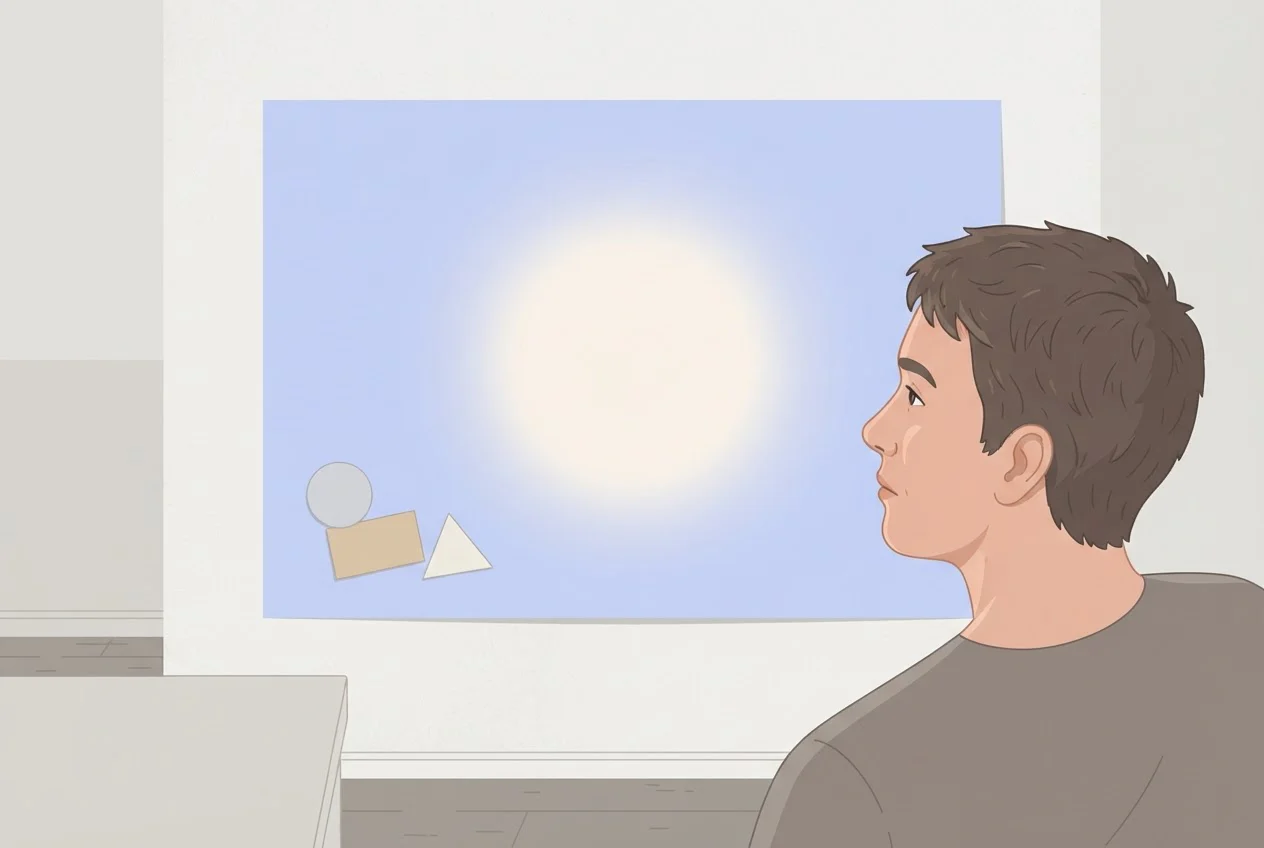
Center bias is viewers' tendency to look near the middle of an image. A map built from that tendency alone scores a correlation of 0.45 on the MIT/Tübingen benchmark, well below the best models but far from zero. Any element placed centrally looks hot whether or not your design earned it.
That baseline knows nothing about the image it scores. It is fitted from where people looked in other images. So the real value of a heatmap sits where it departs from the center: a headline pulled upward, an offer badge off to one side, a face. A hot product in the middle of the frame is weak evidence by itself.
Our recommendation is to judge every must-see element against what a center-only map would have given it. A center-only map is a heatmap built from center bias alone. The check below does exactly that.
How do you check an attention heatmap against center bias?
Divide each must-see element's share of the heat by the share a center-only map would give it. A ratio of 1.5 or more passes, below 1.0 fails, and anything between is unclear. We chose 1.5 by judgment, not by calibrating on real ads: it means the element gets half again as much heat as its position alone explains. Ratios near 1.0 give no evidence either way.
Export the heat layer on its own
as a grayscale image where brighter means hotter. If a tool gives only a colored overlay, match each pixel's color to the nearest color on the tool's own legend bar and use its position on the bar as the heat value. This is approximate where the overlay is semi-transparent. Converting a rainbow overlay to gray without the legend scrambles the scale.Measure each element's box
in pixels (x0, y0, x1, y1) in any image editor. Do this for the product, headline, offer, CTA and brand, and for any decoration you suspect.Save the boxes
in
elements.json, for example{"cta": [300, 1130, 780, 1250]}.Run
python share.py heat.png elements.json. It needs the numpy and Pillow libraries.Read the ratio column
against the thresholds above.
Heat share is the fraction of the map's total heat that falls inside an element's box. The center-only share is the same measure on a smooth bell-shaped blob centered on the image, with a spread of 25% of the width and height. That blob is a simple stand-in for the fitted baseline in the benchmark, so treat ratios as a guide, not a lab result.
import sys, json
import numpy as np
from PIL import Image

heat = np.asarray(Image.open(sys.argv[1]).convert("L"), float)
heat -= heat.min()
heat /= heat.sum()
H, W = heat.shape
y, x = np.mgrid[0:H, 0:W]
center = np.exp(-(((x - W / 2) / (.25 * W)) ** 2 + ((y - H / 2) / (.25 * H)) ** 2) / 2)
center /= center.sum()

boxes = json.load(open(sys.argv[2]))
print("element    area%  heat%  center%  ratio")
for name, (x0, y0, x1, y1) in boxes.items():
    area = (x1 - x0) * (y1 - y0) / heat.size
    h = heat[y0:y1, x0:x1].sum()
    c = center[y0:y1, x0:x1].sum()
    print(f"{name:9} {area:6.1%} {h:6.1%} {c:7.1%} {h / c:6.2f}")
A worked example from our own model. We ran the script on a made-up 1,080 by 1,350 pixel layout (the 4:5 feed ratio) and a made-up map: a center-only blob plus three extra hot spots. It illustrates the arithmetic and is not data from real ads. The four boxes cover 23.0%, 11.4%, 2.9% and 4.0% of the frame.
| Element | Share of frame area | Center-only share of heat | Toy map share of heat | Ratio |
|---|---|---|---|---|
| Product | 23.0% | 47.7% | 49.4% | 1.04 |
| Headline | 11.4% | 7.0% | 10.0% | 1.42 |
| Offer badge | 2.9% | 2.4% | 5.0% | 2.08 |
| CTA button | 4.0% | 3.1% | 1.8% | 0.57 |
On a center-only map, the product holds 47.7% of the heat in 23.0% of the frame, about twice its area, with no help from the design. In the toy map the offer badge passes at 2.08 and the headline is borderline at 1.42. The product's red glow is mostly position, at 1.04. The CTA fails at 0.57, because it gets less heat than a center-only map would have given it.
What should you change when an element fails the center-bias check on an attention heatmap?
Fix position and prominence first, then rerun the center-bias ratio. A failed element usually needs to be larger, higher in contrast, or moved away from a competing hot spot. Changing one thing per rerun shows which change worked.
| Reading | What it means | What to do |
|---|---|---|
| Ratio 1.5 or more | The model finds the element beyond what position explains | Keep it and move on to testing the message |
| Ratio 1.0 to 1.5 | Position is doing much of the work | Enlarge or raise contrast, rerun, and compare |
| Ratio below 1.0 | Something else is pulling attention away | Move, enlarge or remove the competing element |
| No must-see element reaches 1.5 | The map is flat or cluttered | Cut elements until one clearly leads, then rerun |
| A decoration's box holds more heat than any must-see element's box | Attention goes to the wrong place | Mute or move the decoration, then rerun |
| Ratios pass, results disappoint | Visibility was never the problem | Test the offer, message or hook |
A decoration here means any element that is not must-see, such as a background shape or a secondary logo. A heatmap cannot score offer clarity, proof or hook strength. For those, use the creative audit scorecard.
Is a before-and-after attention heatmap the same as an A/B test?
No. A change in predicted attention shows that a model's output moved after you edited the design. An A/B test shows what real people did with each version. Only the second says anything about clicks, conversions or sales.
A heatmap sits at the start of a chain: seen, understood, clicked, bought. An ad can pass the check and still fail because the offer was the problem. For video, hook signals measured from real viewers answer a different question than predicted gaze.
Our recommendation is to use the heatmap as a filter before spend. Drop variants where a must-see element fails, then test the survivors against a fair benchmark; how to choose a creative test control ad covers that step.
That is how we approach it at Deepsolv. The free heatmap tool handles the pre-flight read. The Deepsolv creative intelligence platform handles what comes after: it combines ad-performance data, competitor activity, customer signals and past ad learnings into ranked weekly creative test plans and execution-ready briefs for teams running Meta ads. Pricing is shared in a personalized demo with our founding team, so book a Deepsolv demo and ask.
Is an attention heatmap in machine learning the same thing?
No. In machine learning an attention heatmap is a grid of weights showing how strongly one token (a word piece) or image patch draws on another inside one layer (one stage of the network) and one head (one of several attention calculations run side by side in that layer) of a transformer, a neural network built on attention (Vaswani et al., 2017). It shows how information flows inside a model, not where a person looks.
Each row is one query (the token asking) and each column one key (the token being looked at). A softmax, the step that turns scores into weights, makes every row sum to one. A bright cell means a large weight in that head and layer, not that the token caused the prediction. Experiments on text classification found attention weights frequently uncorrelated with gradient-based measures of feature importance (a way of testing which inputs changed the output most). They also found very different attention patterns that give the same prediction (Jain and Wallace, 2019). Use these maps to inspect and debug a model, and confirm any claim about cause with another method.
Turn heatmap reads into ranked creative test plans
Frequently asked questions
Load a transformer with output_attentions=True in the Hugging Face transformers library. Take one layer and one head from the returned attention tensors. Draw that matrix with matplotlib's imshow or seaborn's heatmap, labeling both axes with the tokens. Look at single heads, since averaging can hide patterns.
Yes. Our free ad attention heatmap tool needs no signup. It accepts up to five JPEG, PNG or WebP images of up to 10 MB each, and it does not store your creatives. It marks red and yellow areas as more likely to attract attention. To run the center-bias check on that overlay, use the legend-matching step above and treat the ratios as approximate.
Sources
- 1.UIGaze: How Closely Can VLMs Approximate Human Visual Attention on User Interfaces?: 62 participants, 1,980 screenshots, nine models.
- 2.MIT/Tübingen Saliency Benchmark results (MIT300): correlation scores for the best model, the center-bias baseline and the gold standard.
- 3.Jain and Wallace, "Attention is not Explanation," NAACL 2019
- 4.Vaswani et al., "Attention Is All You Need," 2017
- 5.Vendor accuracy wording (Neurons, Attention Insight, Jarville, Switas), quoted from each vendor's public page, read October 2026., October 2026